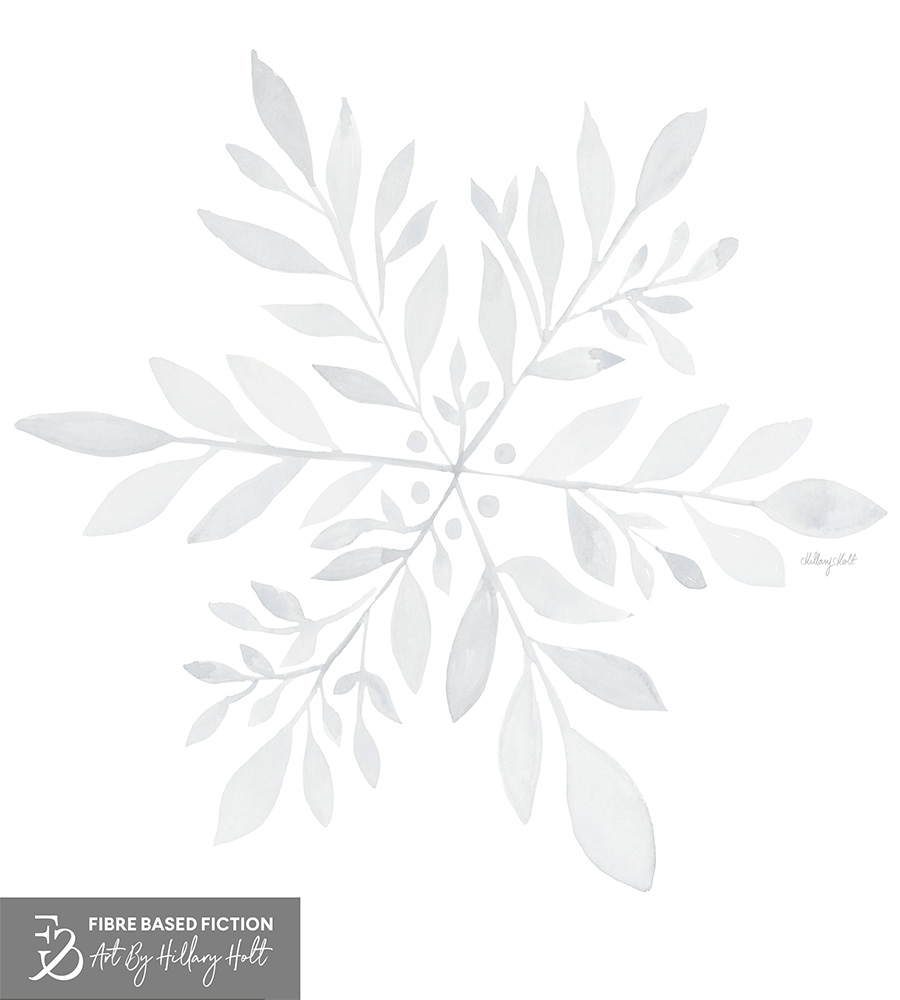
White is the absence of color
And the Pantone color of the year for 2026 is….. white. WHITE?!!!
I was SO excited to learn what I’d have to work with when the color of the year was announced. I had struggled with Mocha Mousse. It never seemed rich or subtle enough. While I do love a good neutral, I felt like it needed color as a contrast. So I was ready for change. But I was not ready for white.
It’s like working with a blank canvas. A clean slate. No color at all. It’s like Pantone have cancelled color of the year. How can rising trend of maximalism be interpreted with white?! It seems that in the surface design industry I am not alone. There was disappointment. Outrage. Bewilderment. There were memes circulating of a poo emoji next to a roll of toilet paper.
Pantone claims that “PANTONE 11-4201 Cloud Dancer, is a key structural color whose versatility provides scaffolding for the color spectrum, allowing all colors to shine.” Versatility? How can there be versatility in nothing? When the shock wore off I looked into who/what else would be leading color trends.
WGSN announced Transformative Teal for 2026
The Pantone Roundup of New York Fashion Week Spring Summer top colors with rich jewel tones and pops of Acacia yellow.
Benjamin Moore for interiors highlights the refined elegance of Silhouette – burnt umber with notes of charcoal, and BEHR’s pick is the gentle and captivating Hidden Gem. Their palette of warm neutrals and soft pastels is also worth noting.
I guess the moral of the story is that this year is not going to be about a color, but what you build around it. And perhaps by avoiding a commitment to color, your palette options are really open-ended. I used the Cat Coq weekly prompt to lean into white with a botanical inspired snowflake. And was surprisingly pleased with the results. Perhaps there is room for Cloud Dancer to grow on me.